
Grand Rapids Public Library
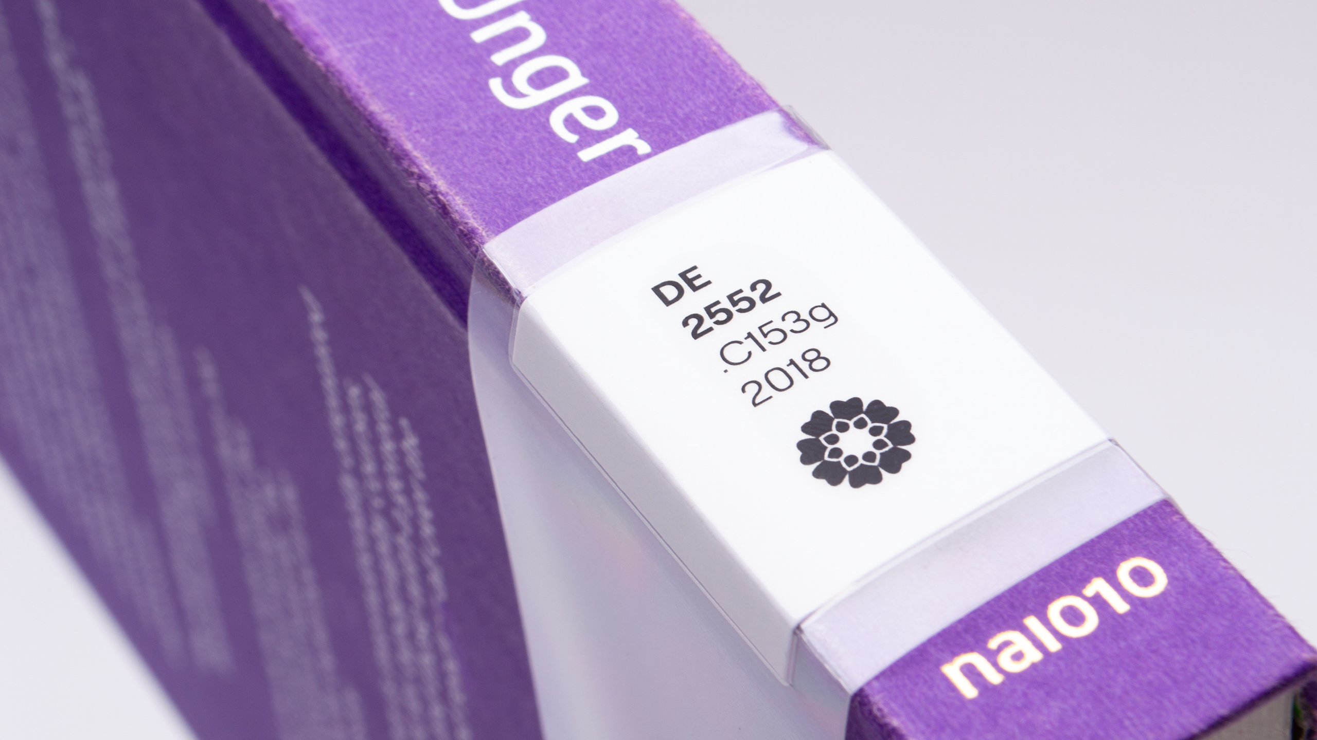
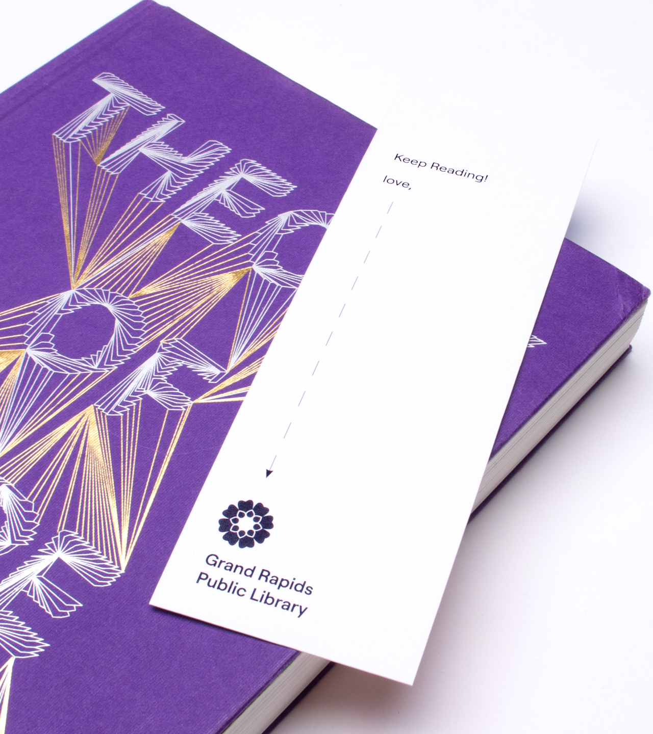
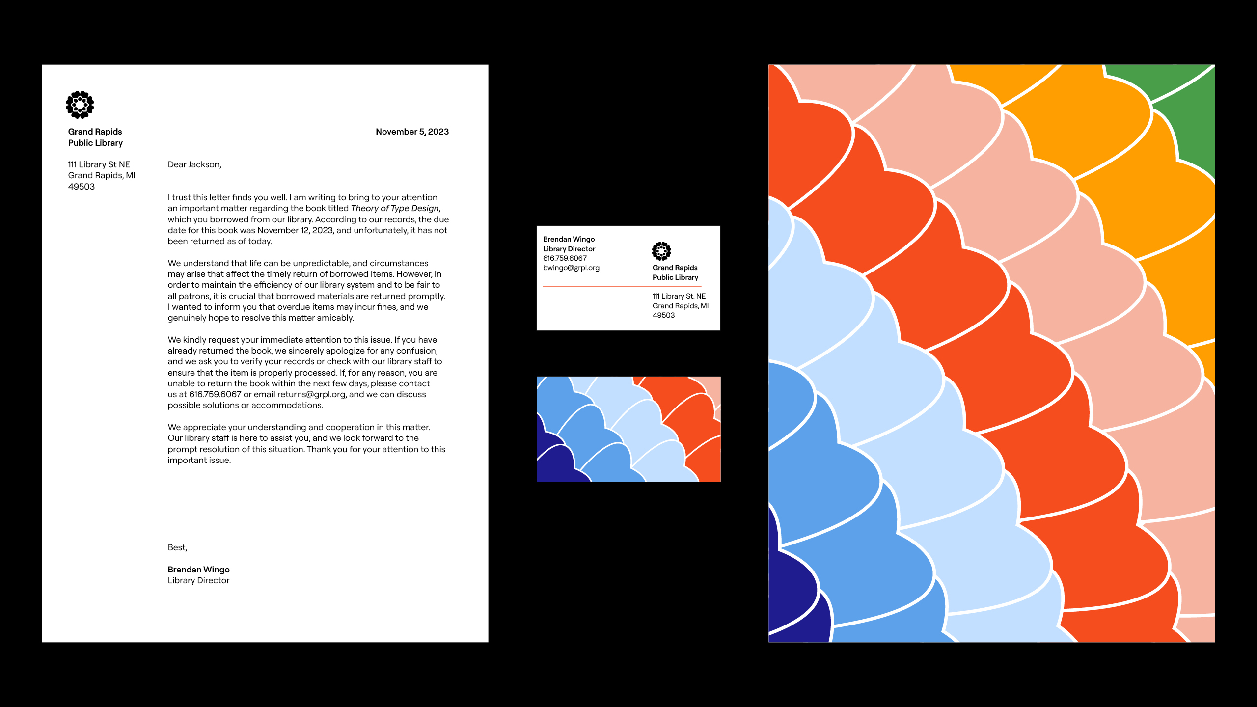
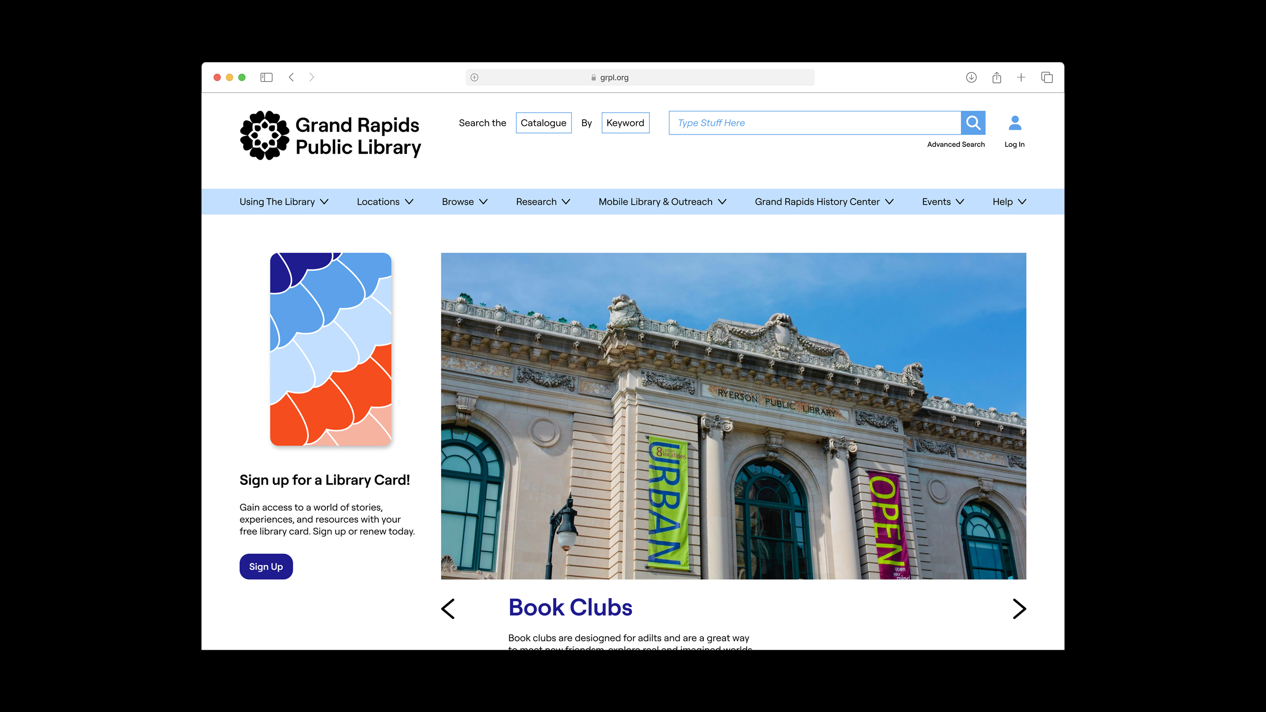
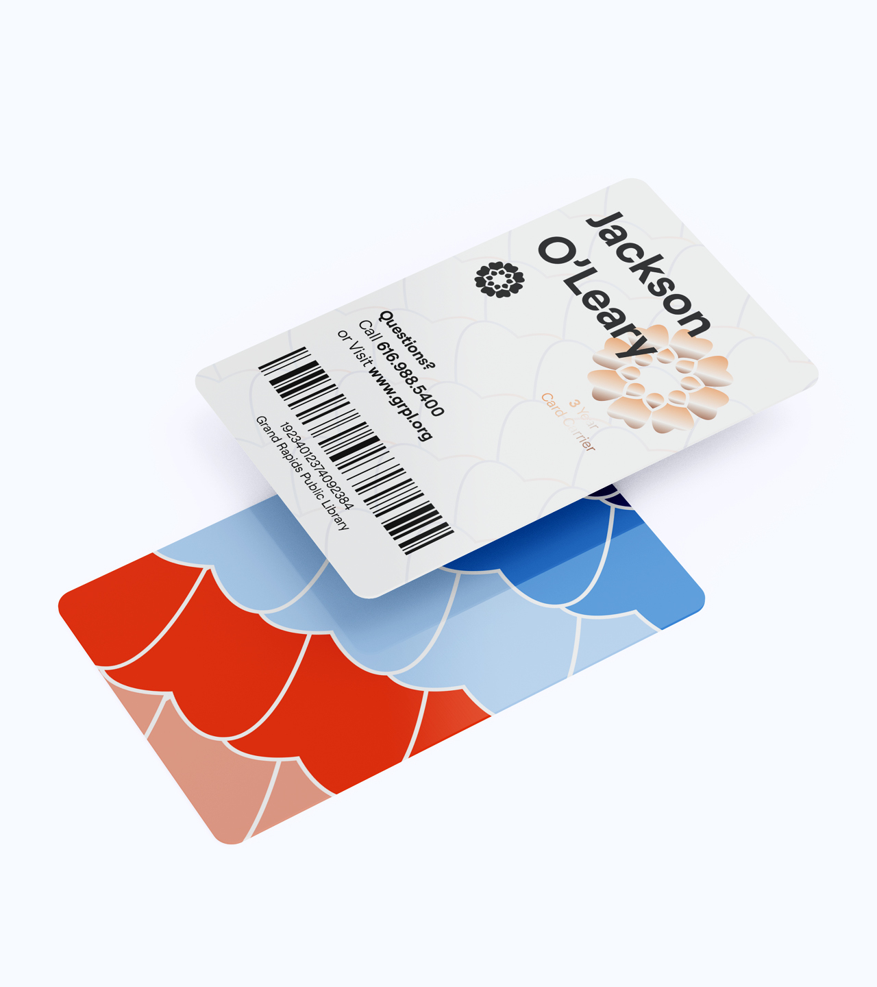
The Grand Rapids Public Library is an institution which has served the public for over 150 years, providing people with a peaceful space to build communities and learn new things.
An homage to their history and to the beautiful building the main branch is located in, their mark is inspired by an architectural motif found on the Ryerson building.
The brand is meant to feel as inviting as possible, using colors inspired by the Michigan wilderness and a nice open sans-serif typeface.

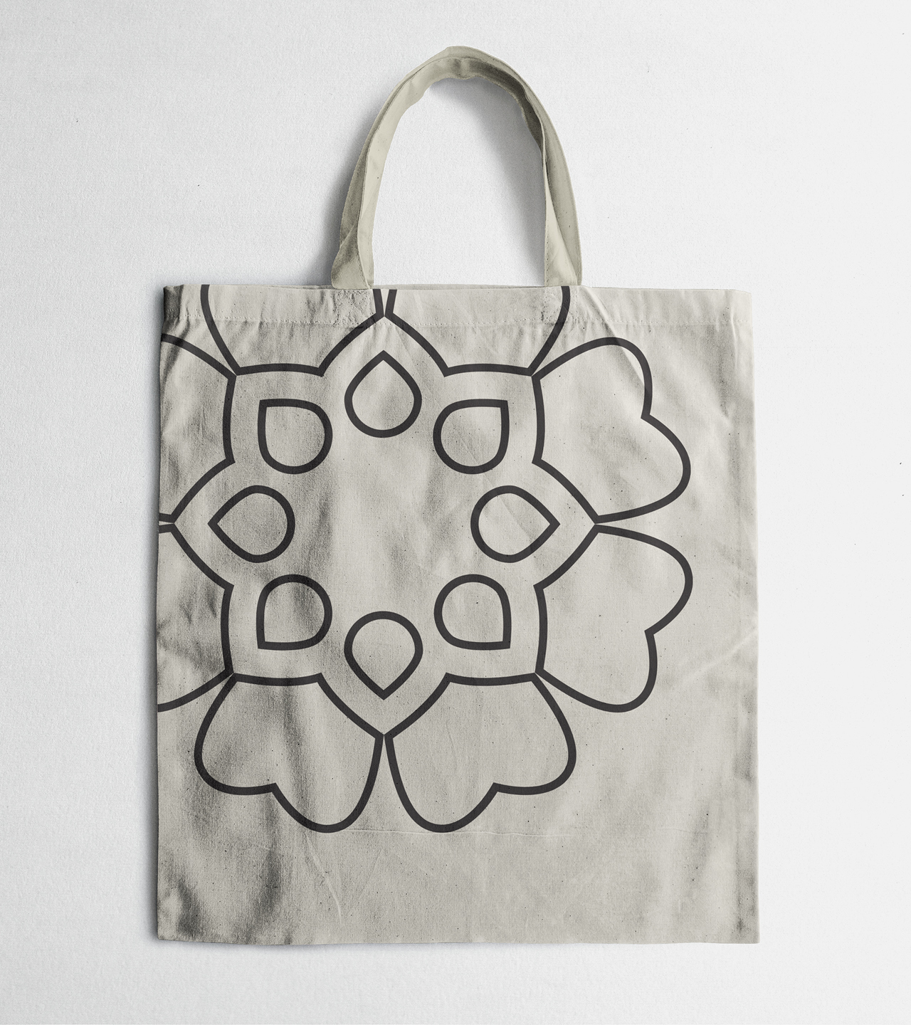
ArtPrize
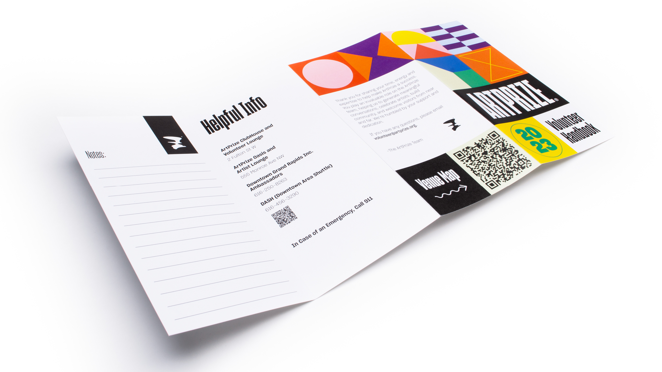
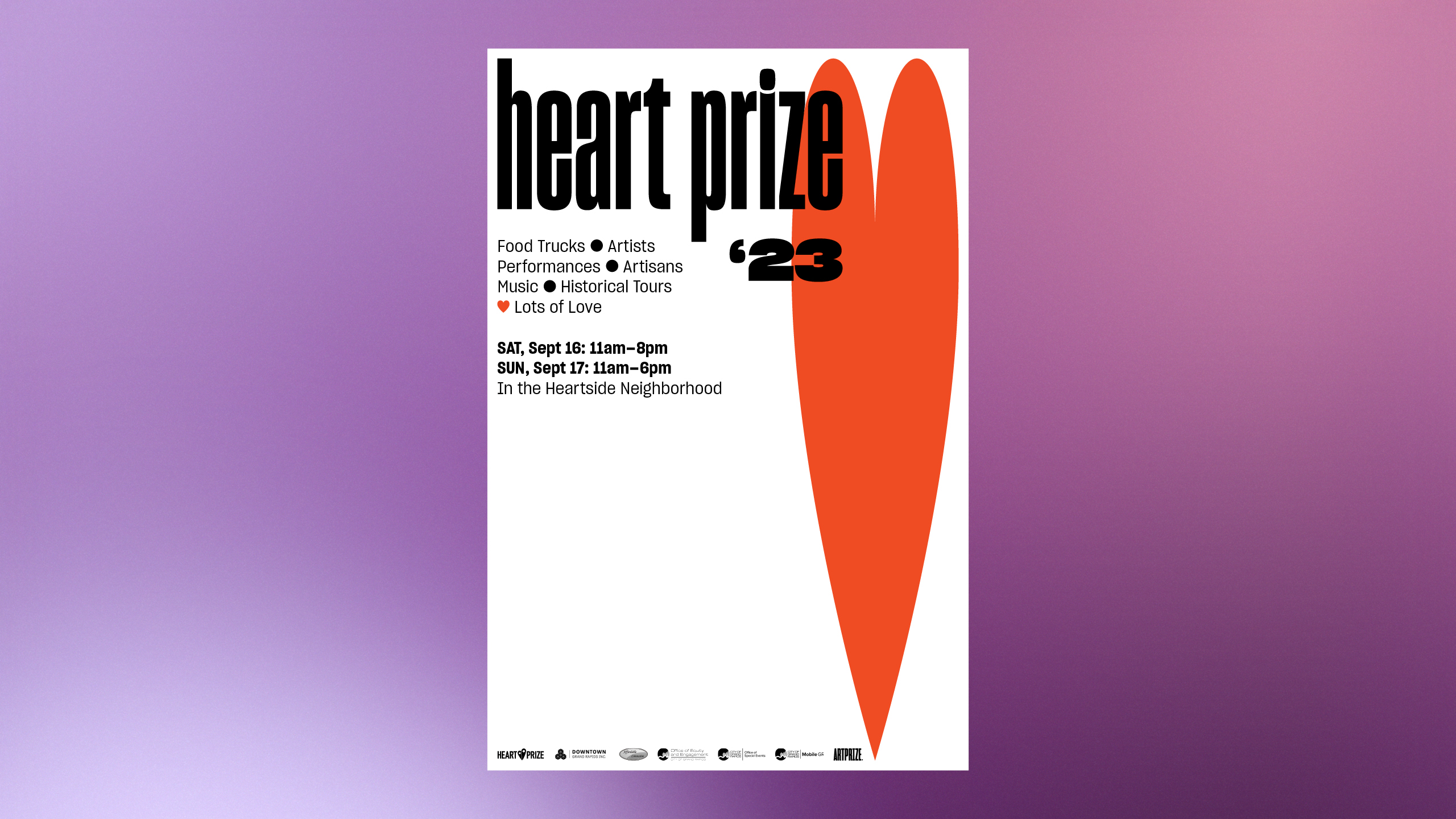
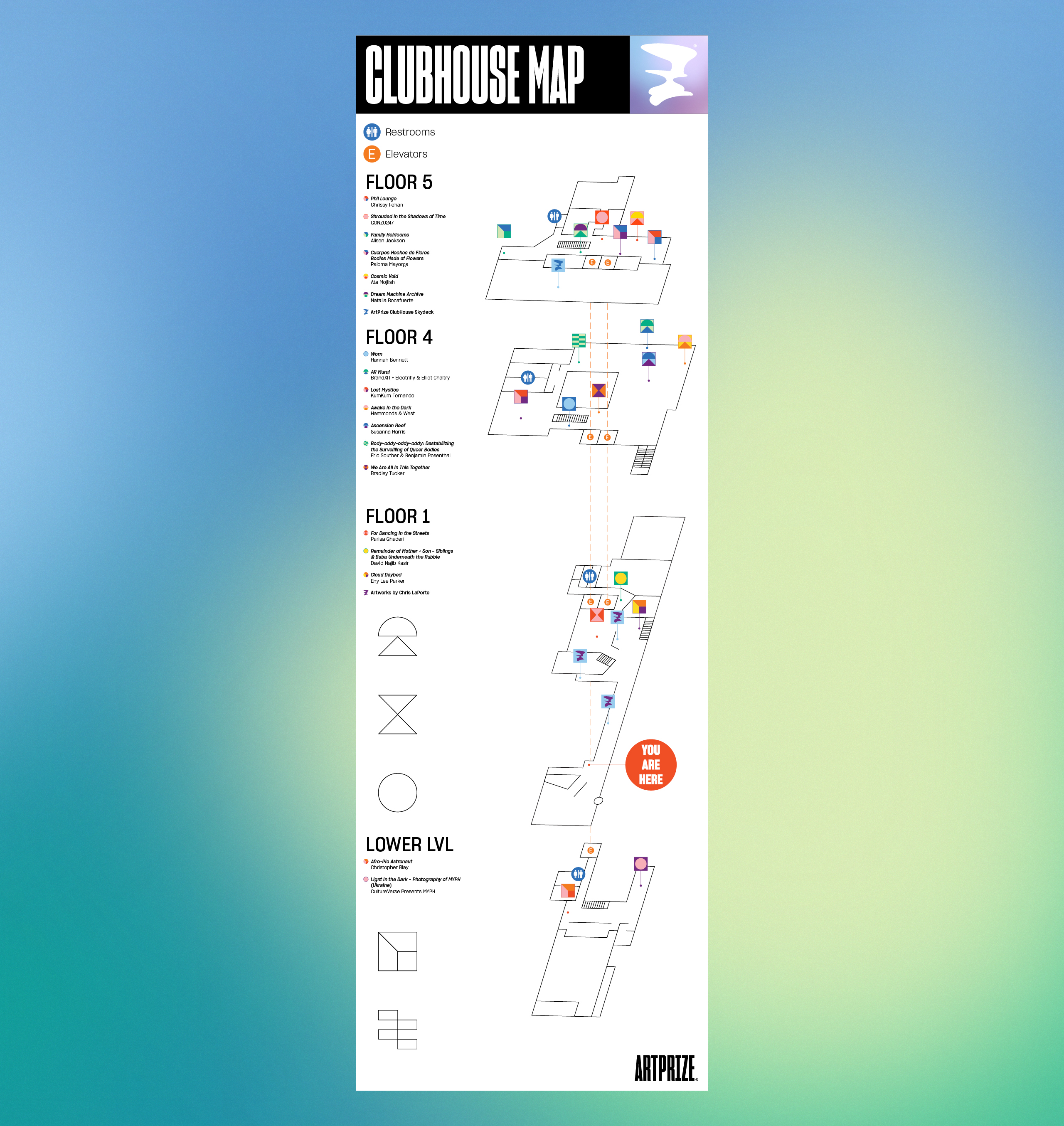
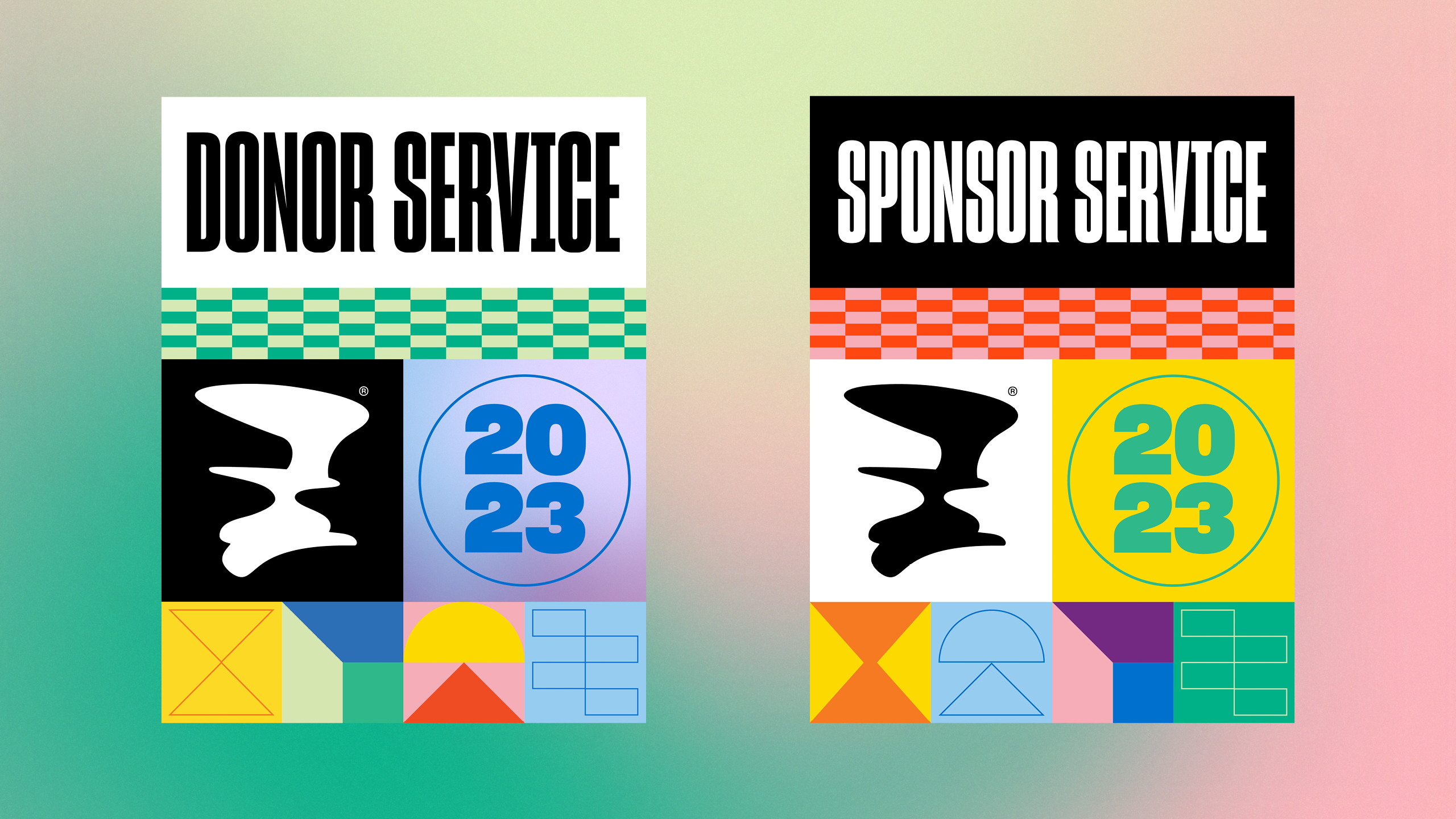
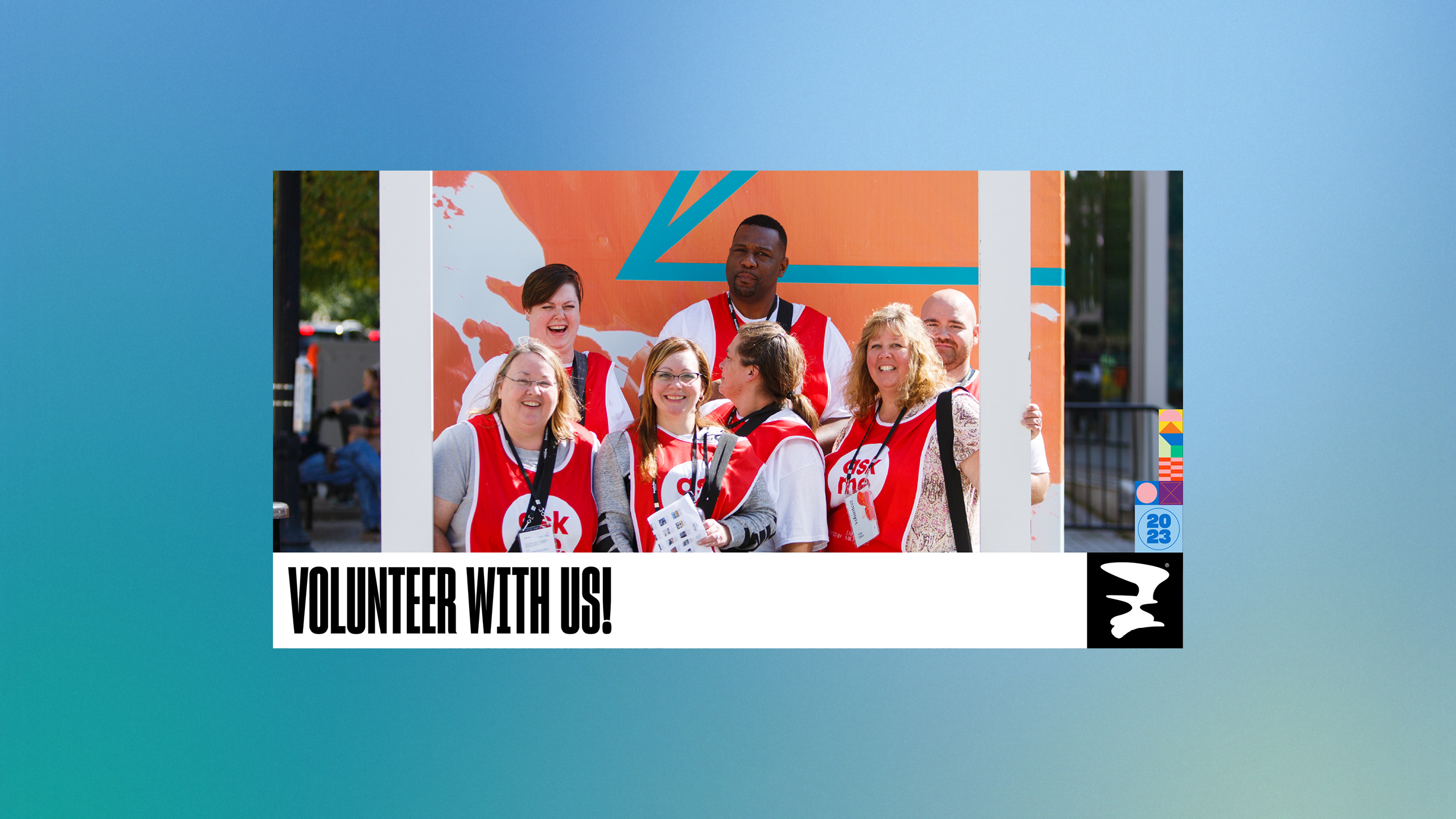
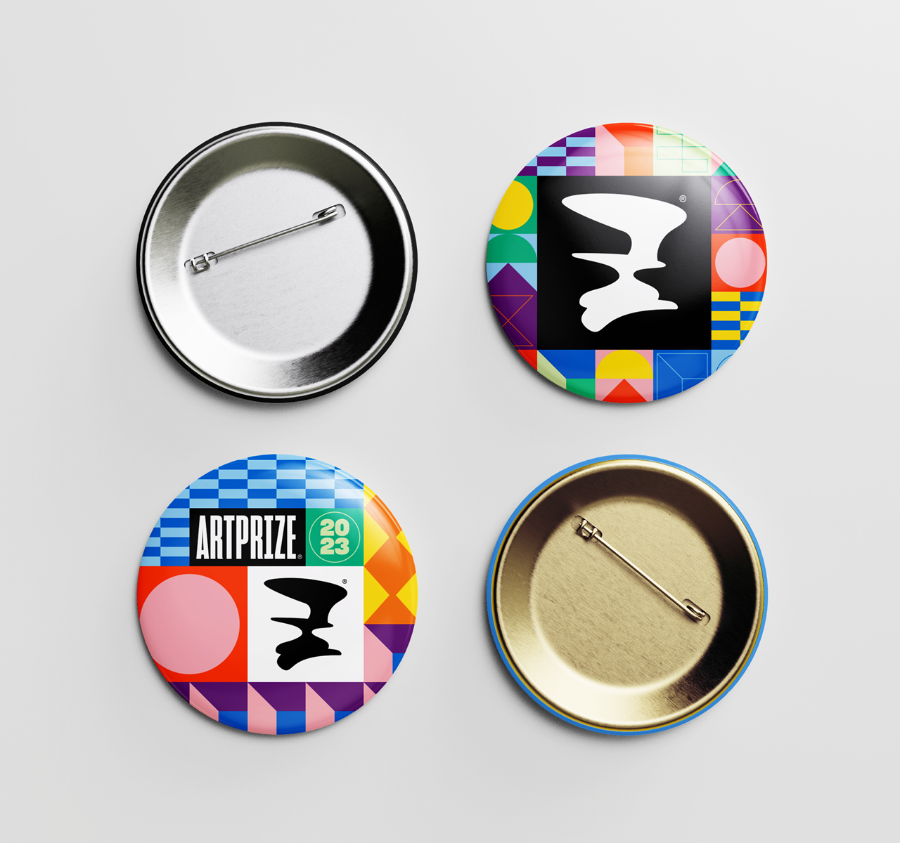
This section contains work I designed while working as an intern for ArtPrize, an international art show which takes place throughout the city of Grand Rapids annually. Hundreds of artists participate and the event often draws tens of thousands of spectators.
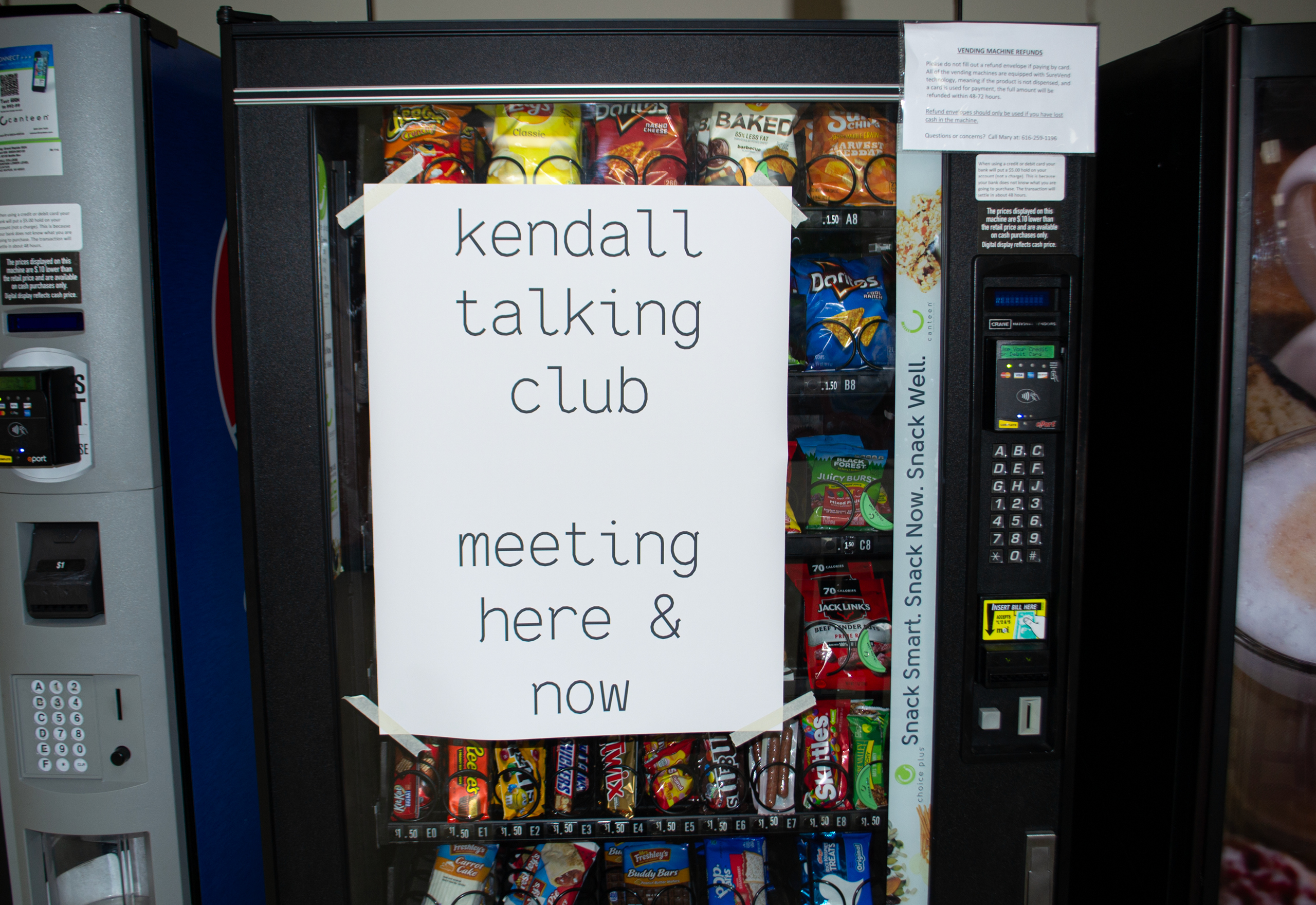
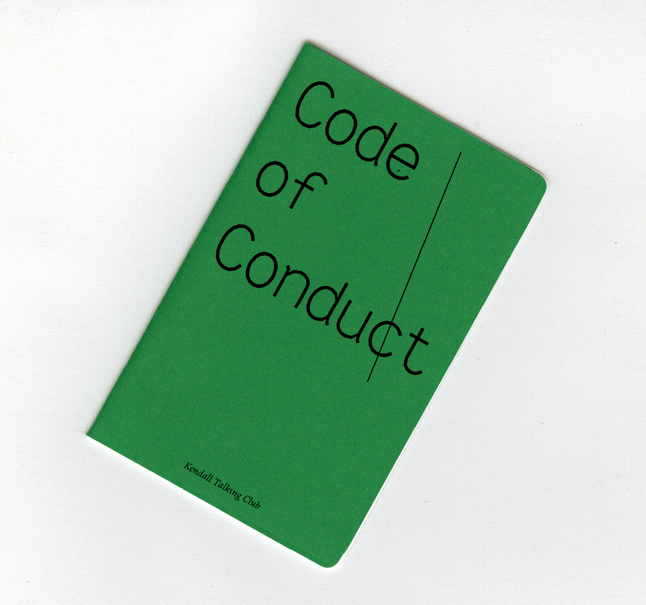
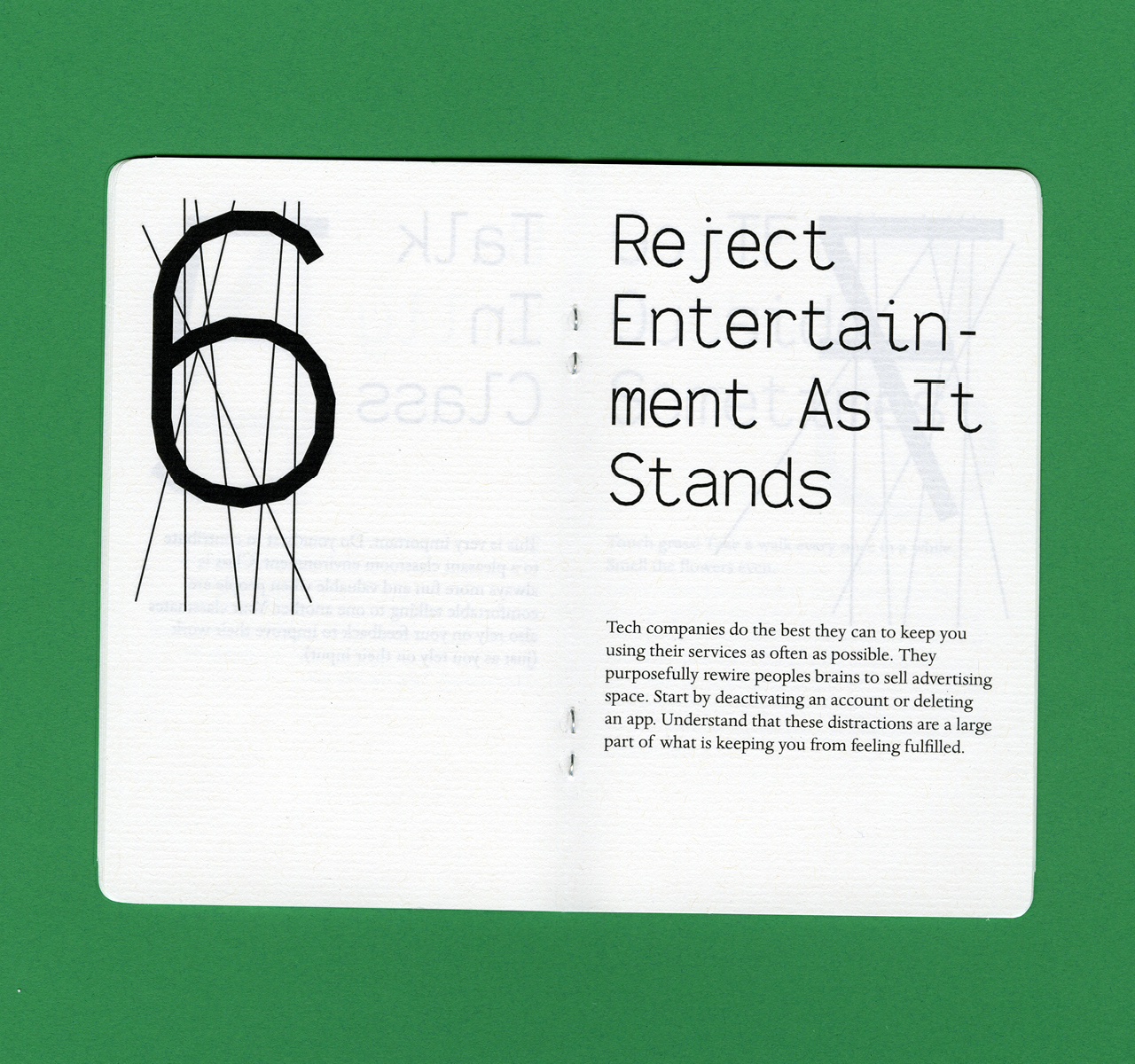
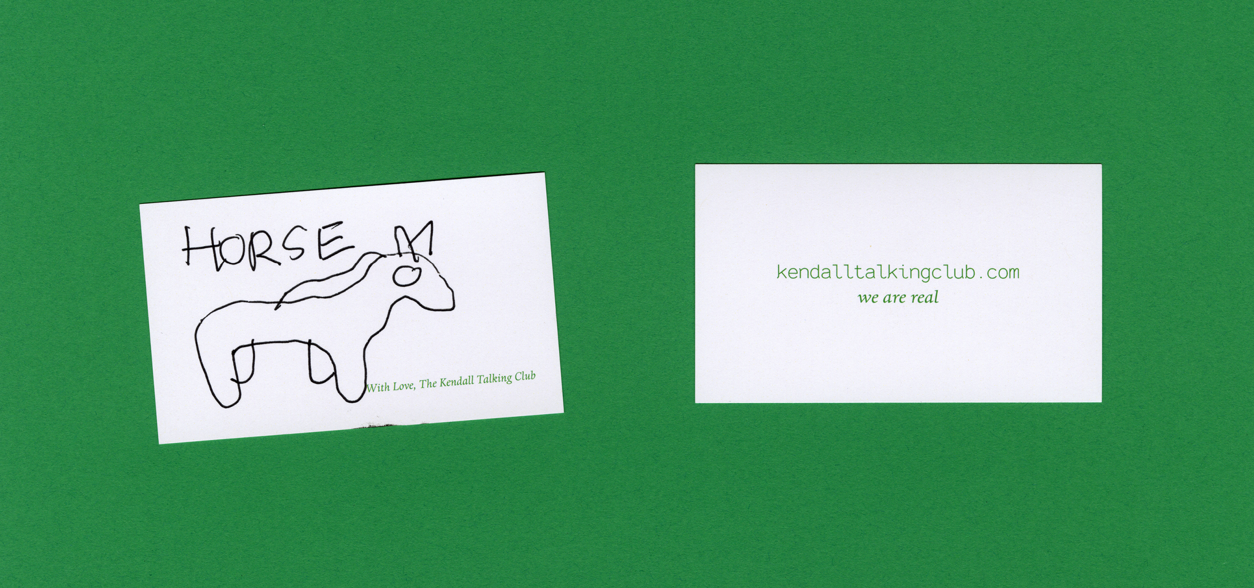
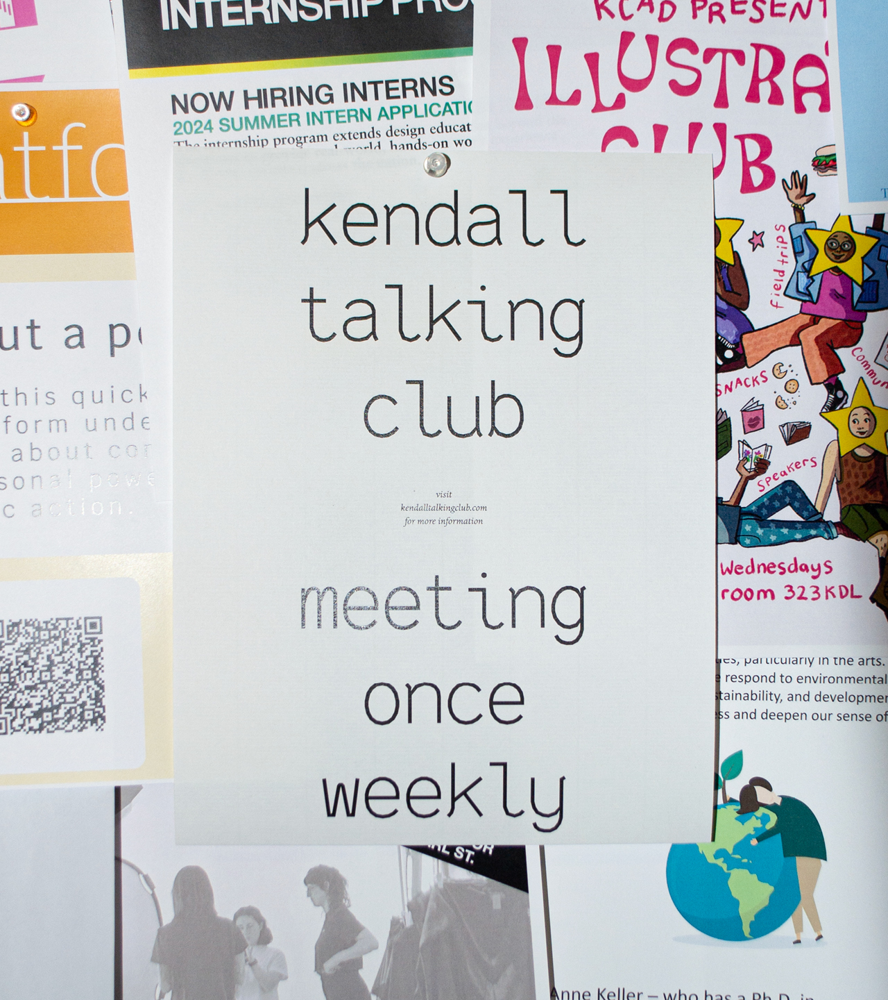
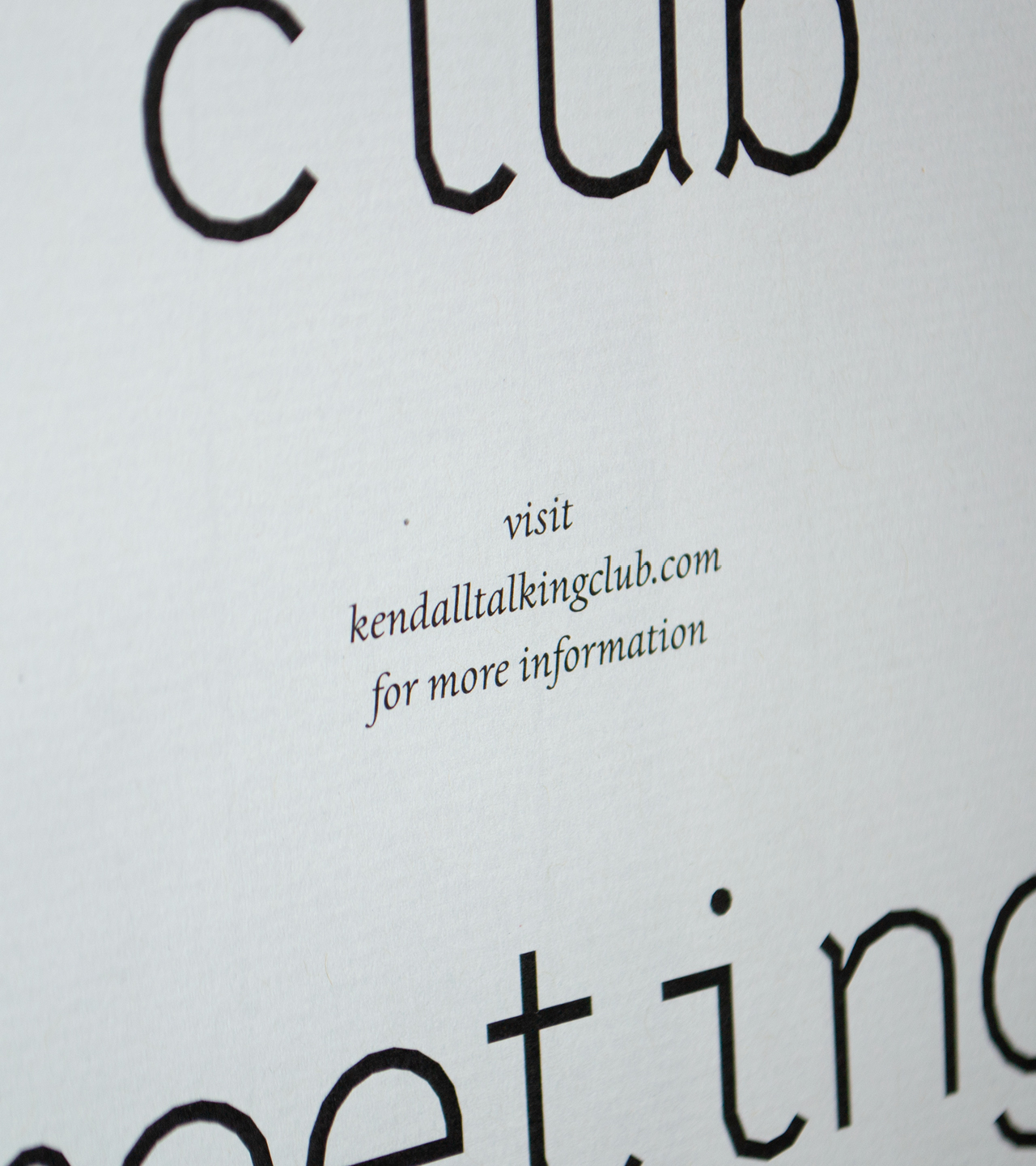
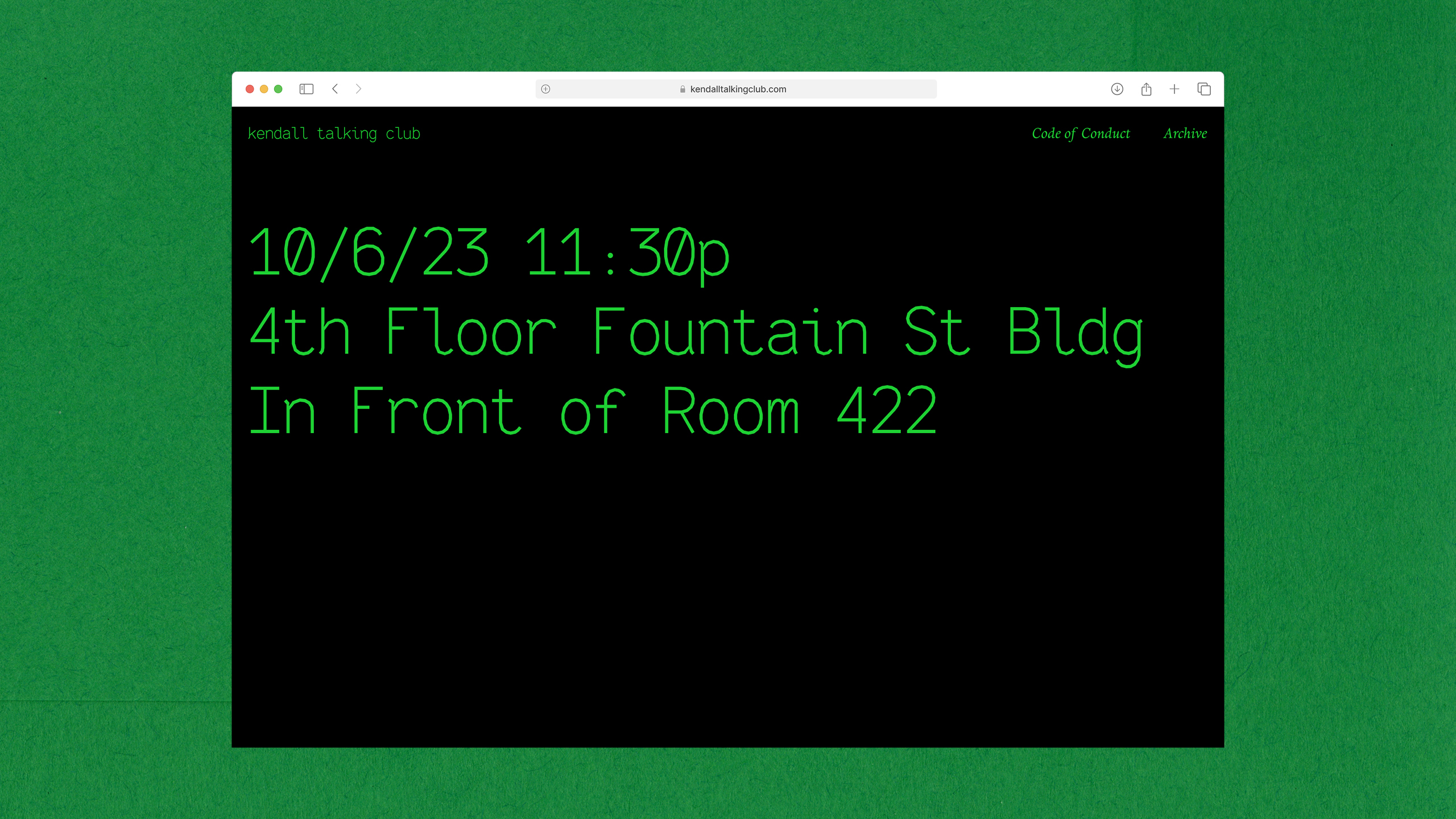
Kendall Talking Club
A club where its members simply converse.
Service Reproduction Company
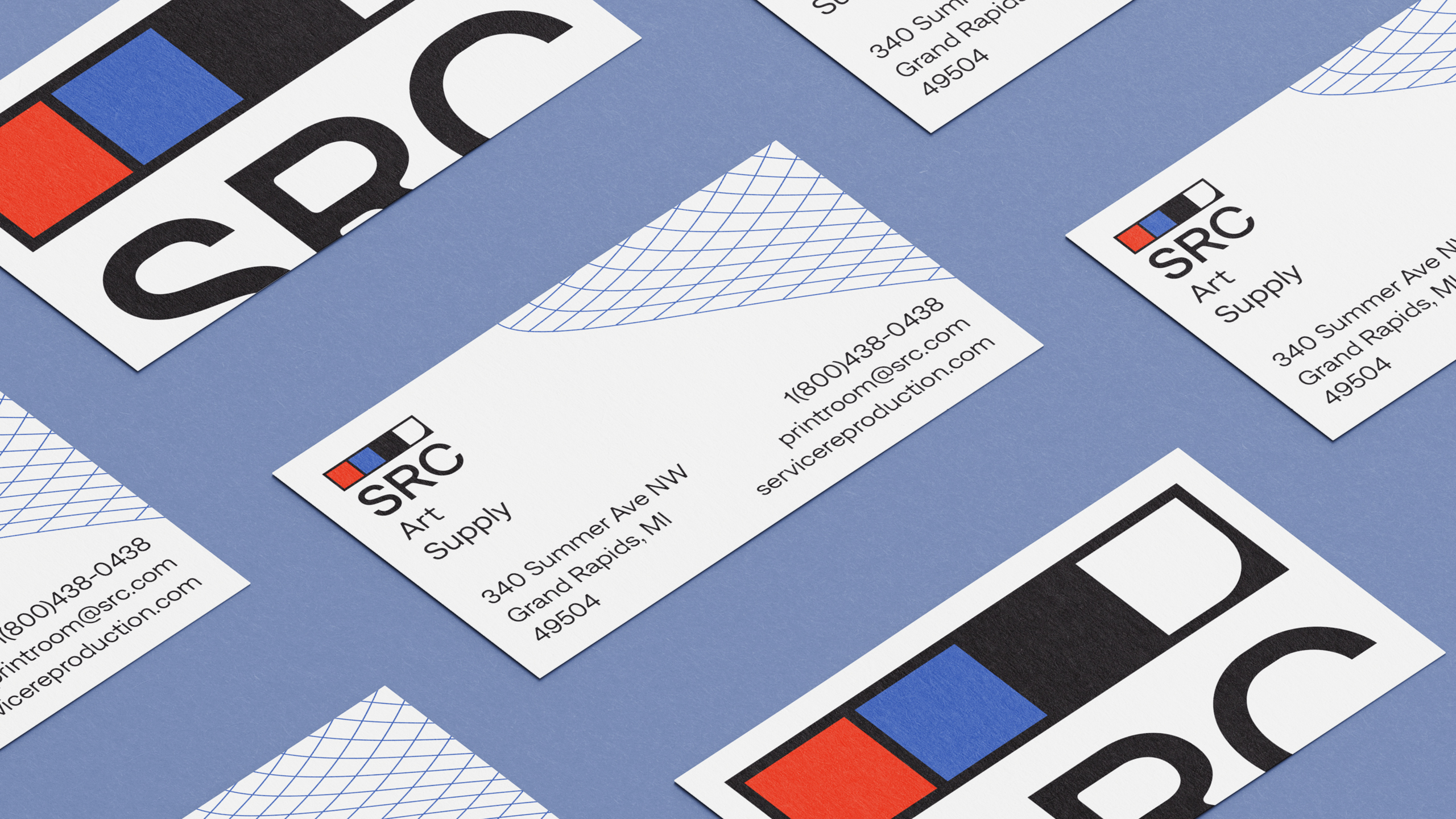
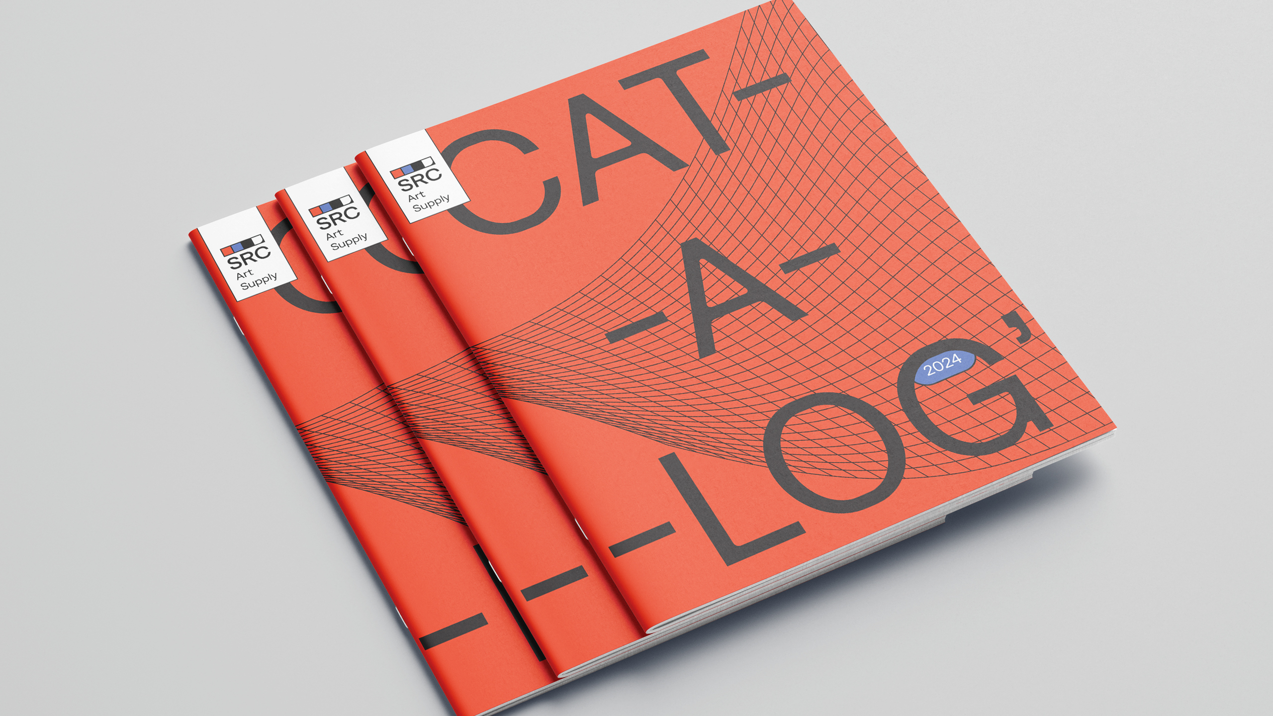
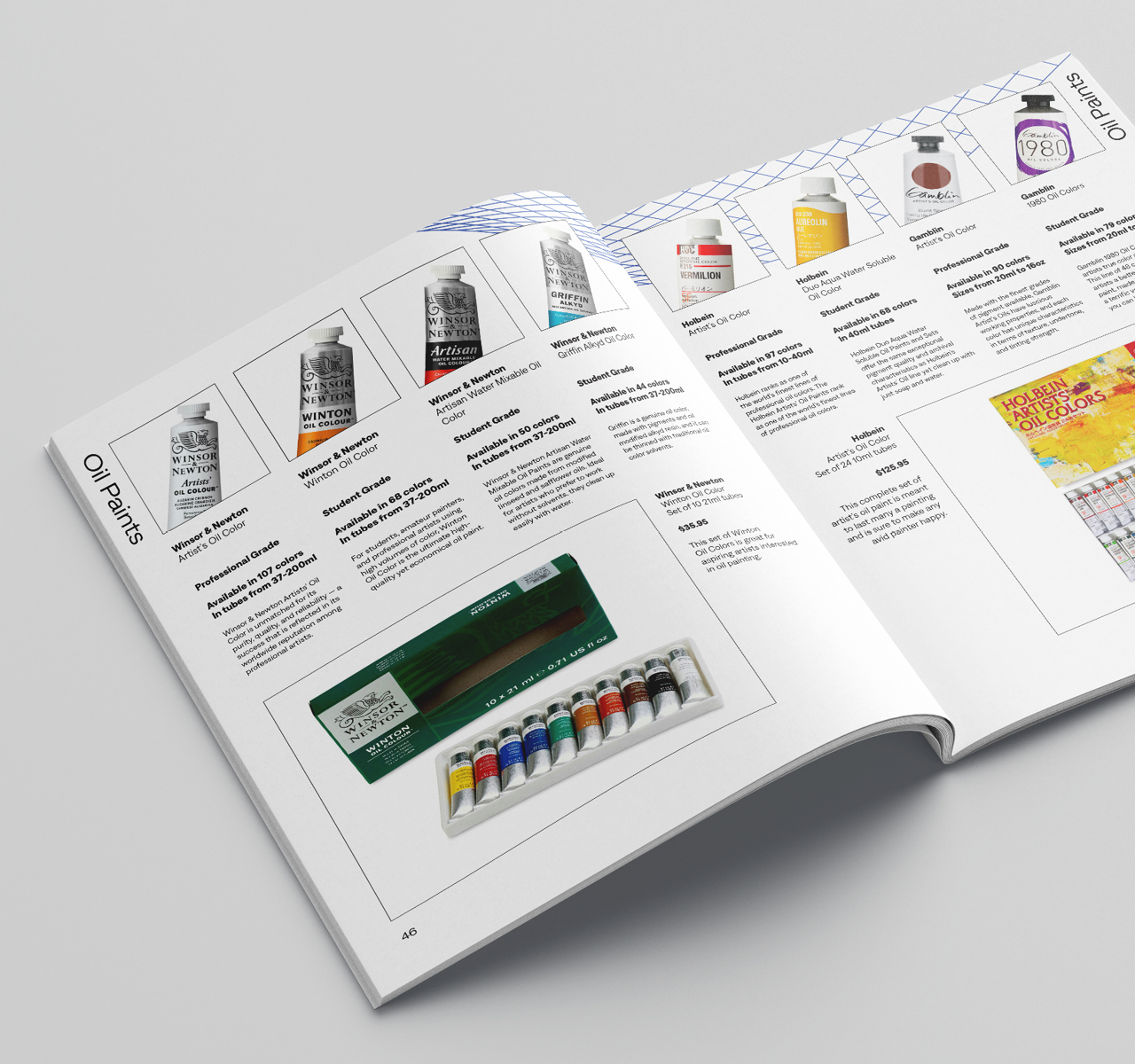
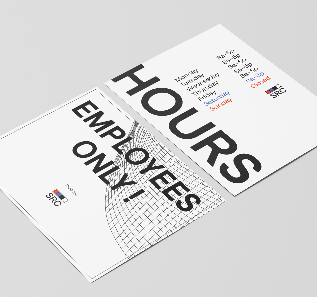
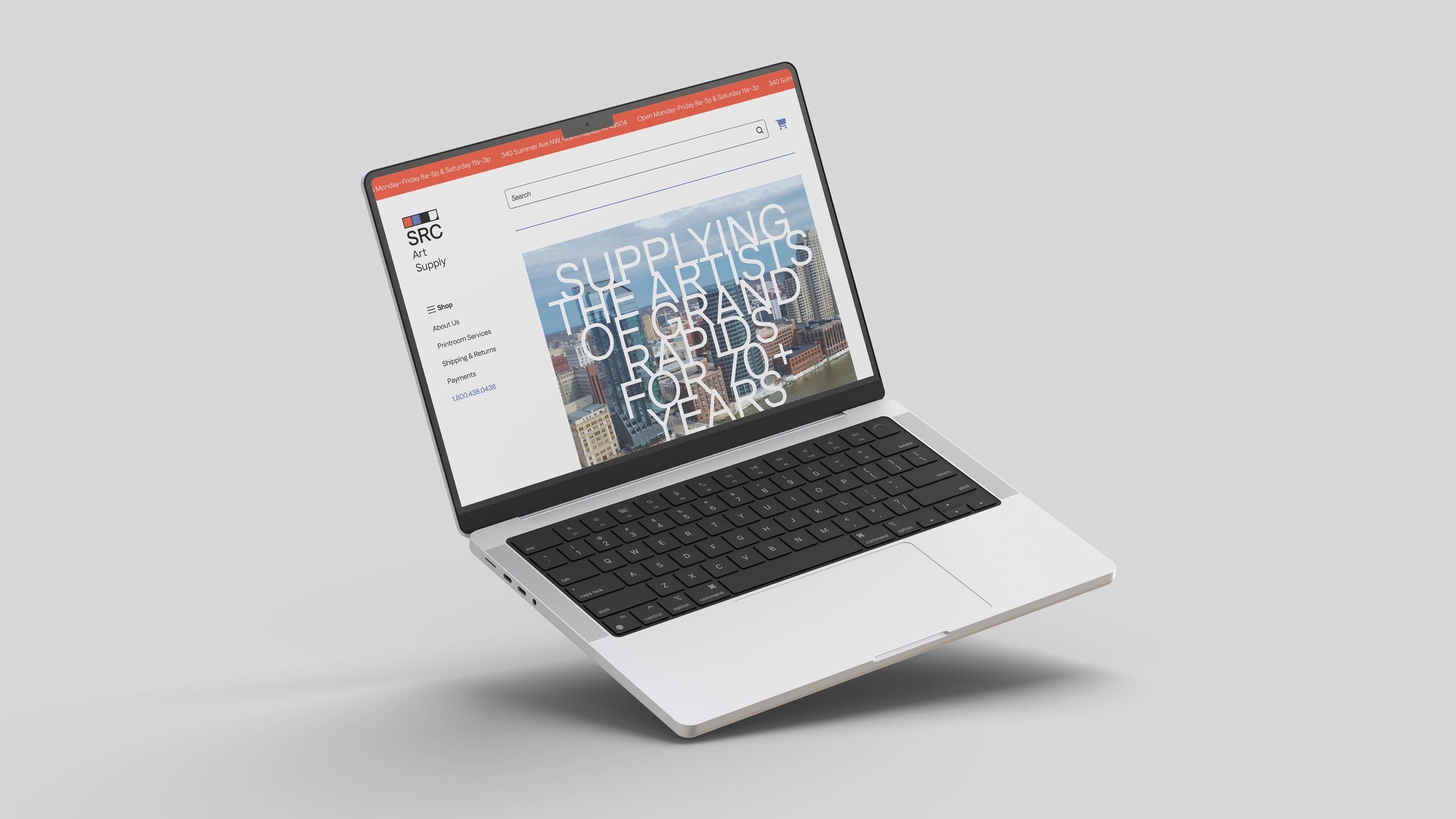
Service Reproduction Company is a small art and drafting supply store in Grand Rapids, Michigan which has been serving its community for 80+ years.
Their brand is meant to both honor their history as a drafting company and to bring them into the modern age with a contemporary typeface and mark which will appeal to their primary market of young artists and designers.
Looking
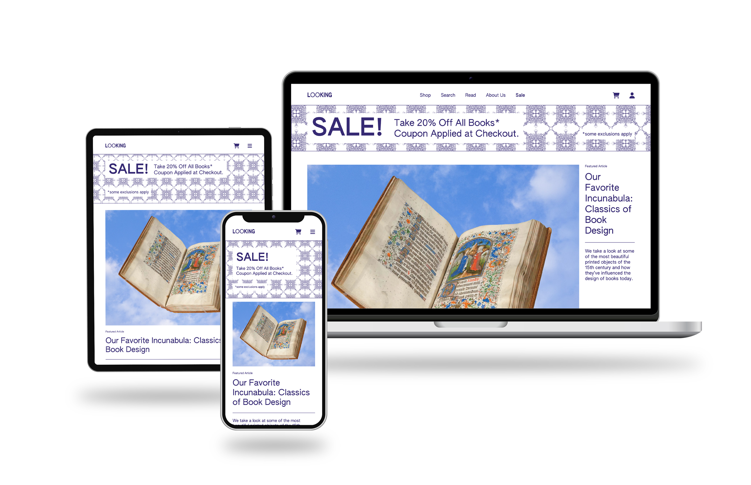
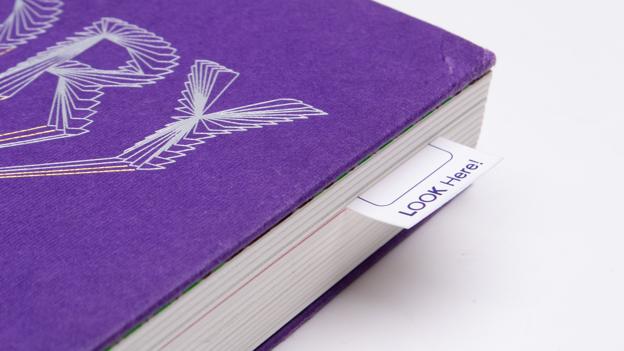
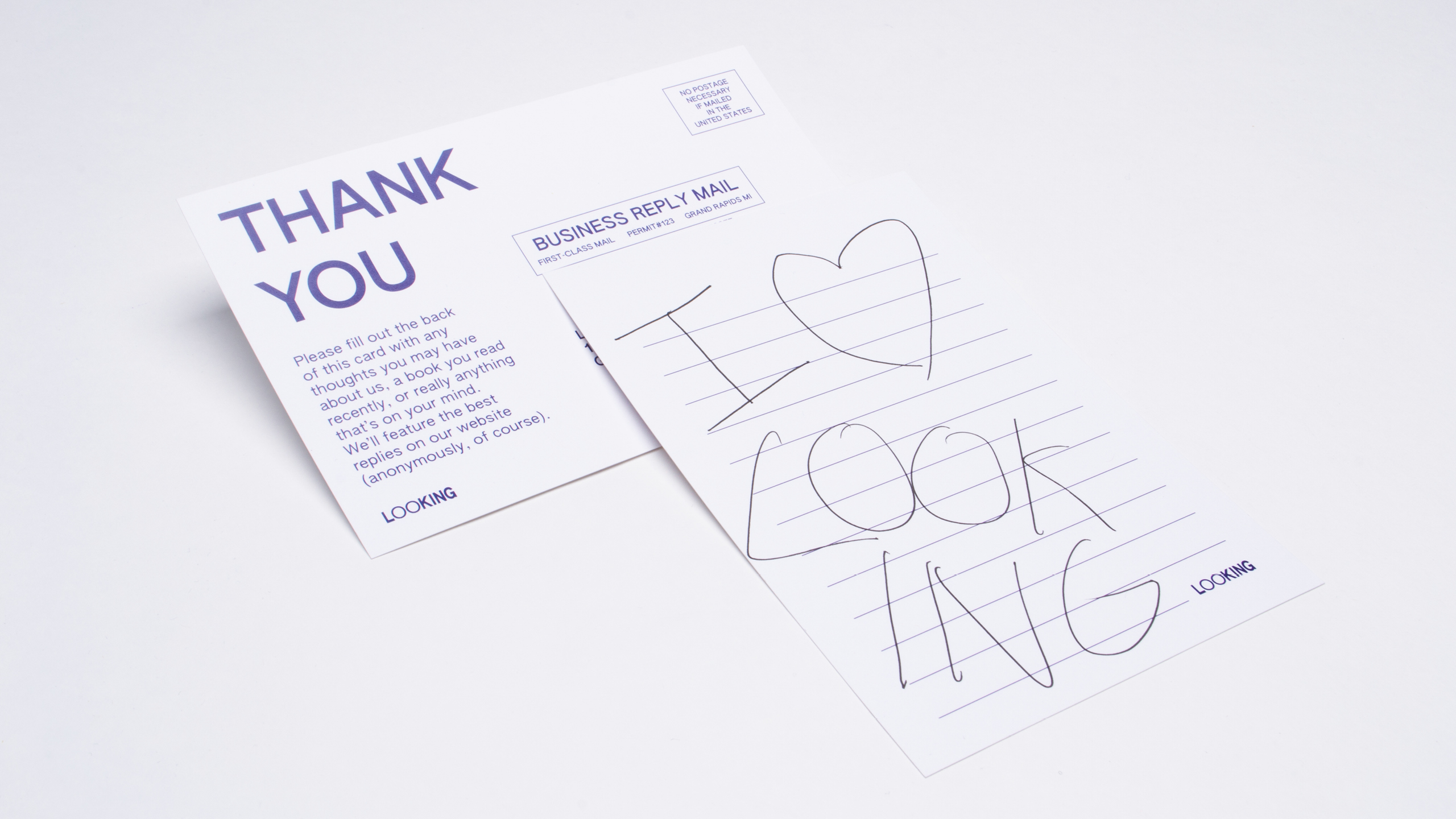
Looking is an online bookstore which specializes in the thoughtful curation and promotion of books/publications that interest the staff of Looking. Looking writers frequently author reviews of books new and old, and write opinion pieces about all matter of things related to publications. It could be summarized as a book review journal combined with an actual retail platform.
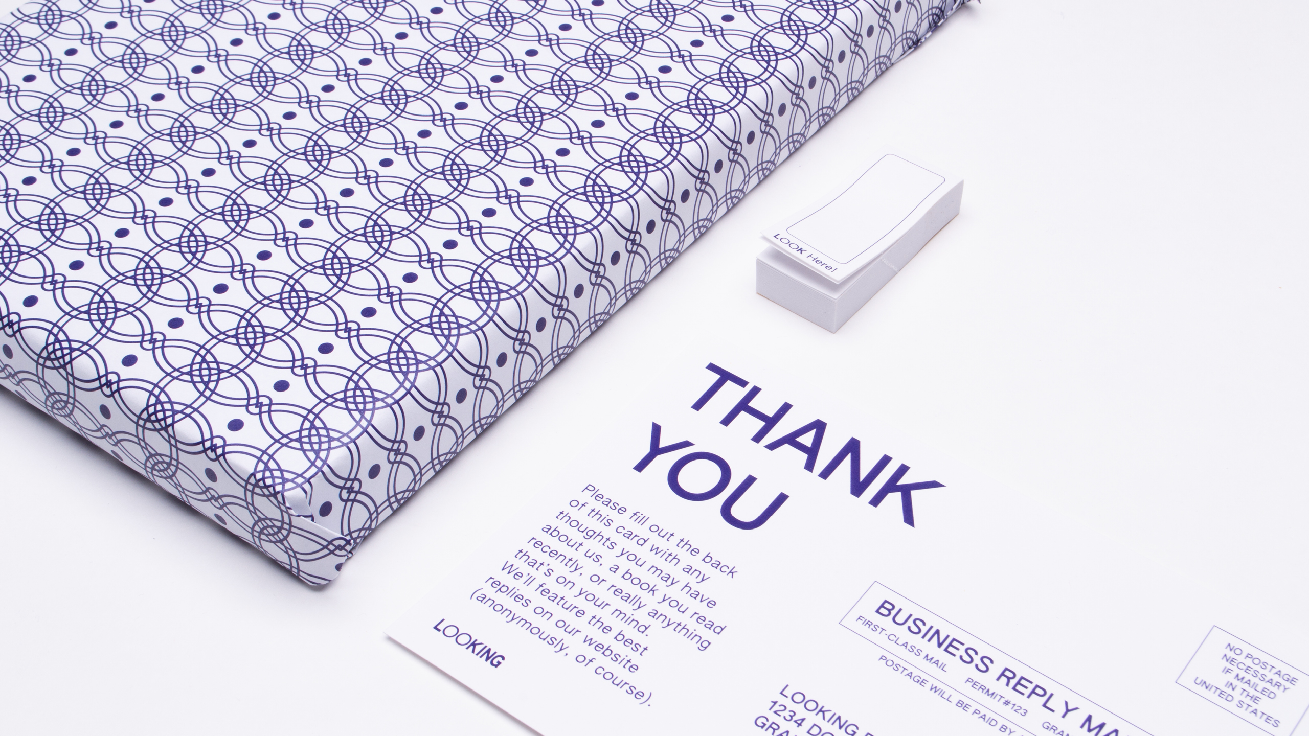
Looking’s brand is meant to give on aire of sophistication combined with a contemporary edge. The use of one color and one typeface family is meant to communicate purely and simply, and patterns based on book endpapers ground the brand in history and physicality.
Posters
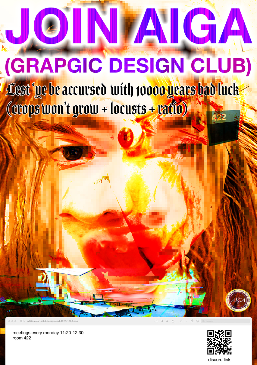
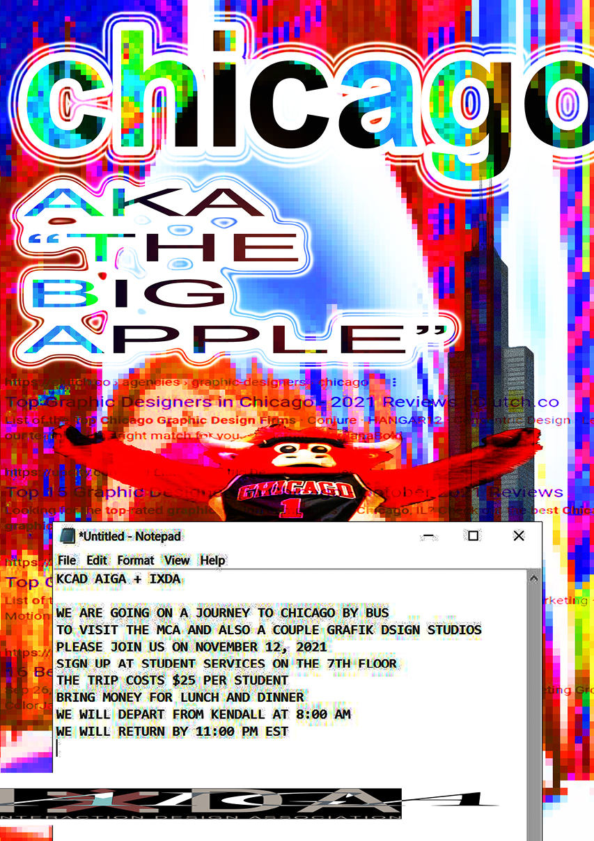
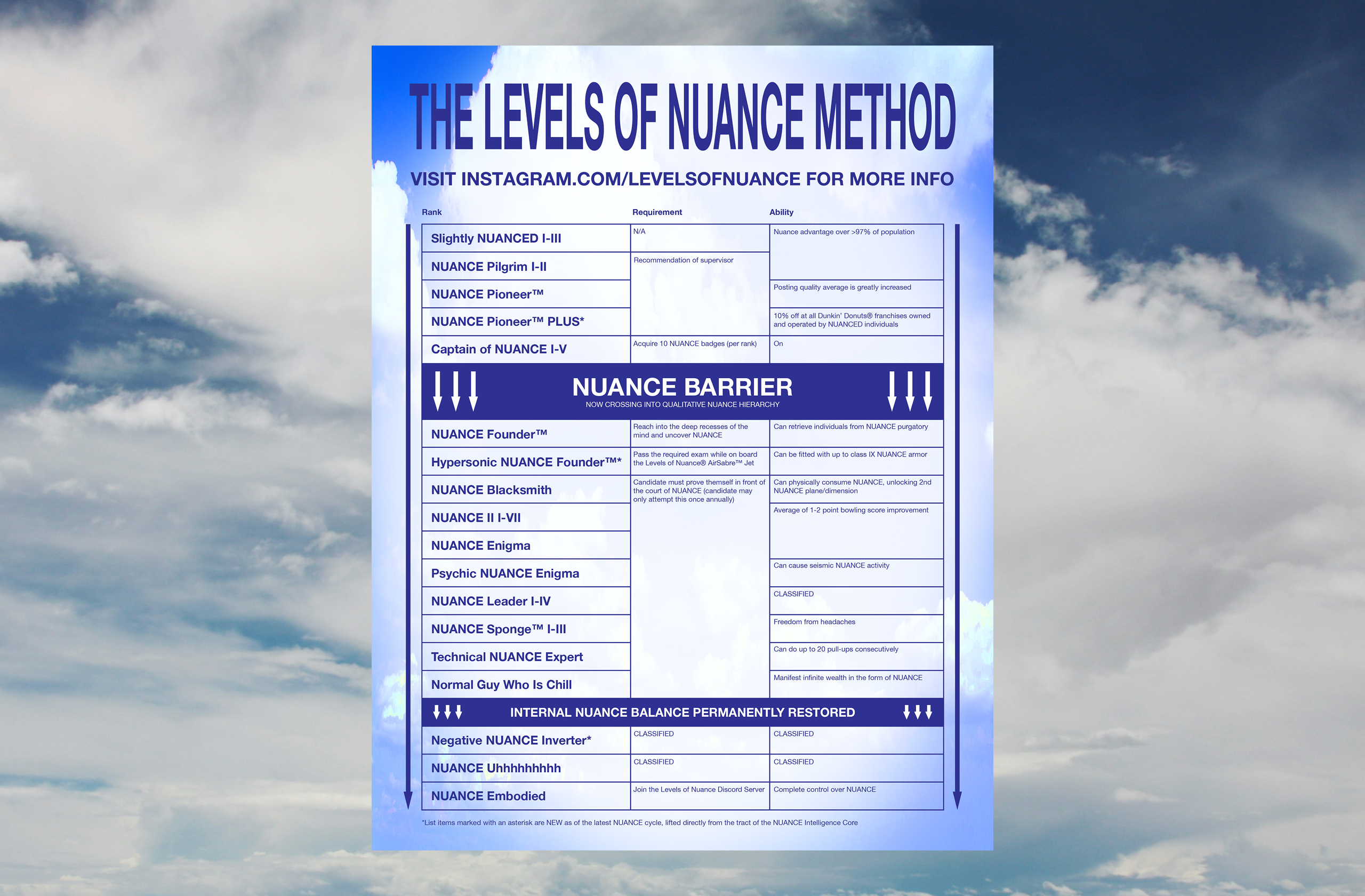
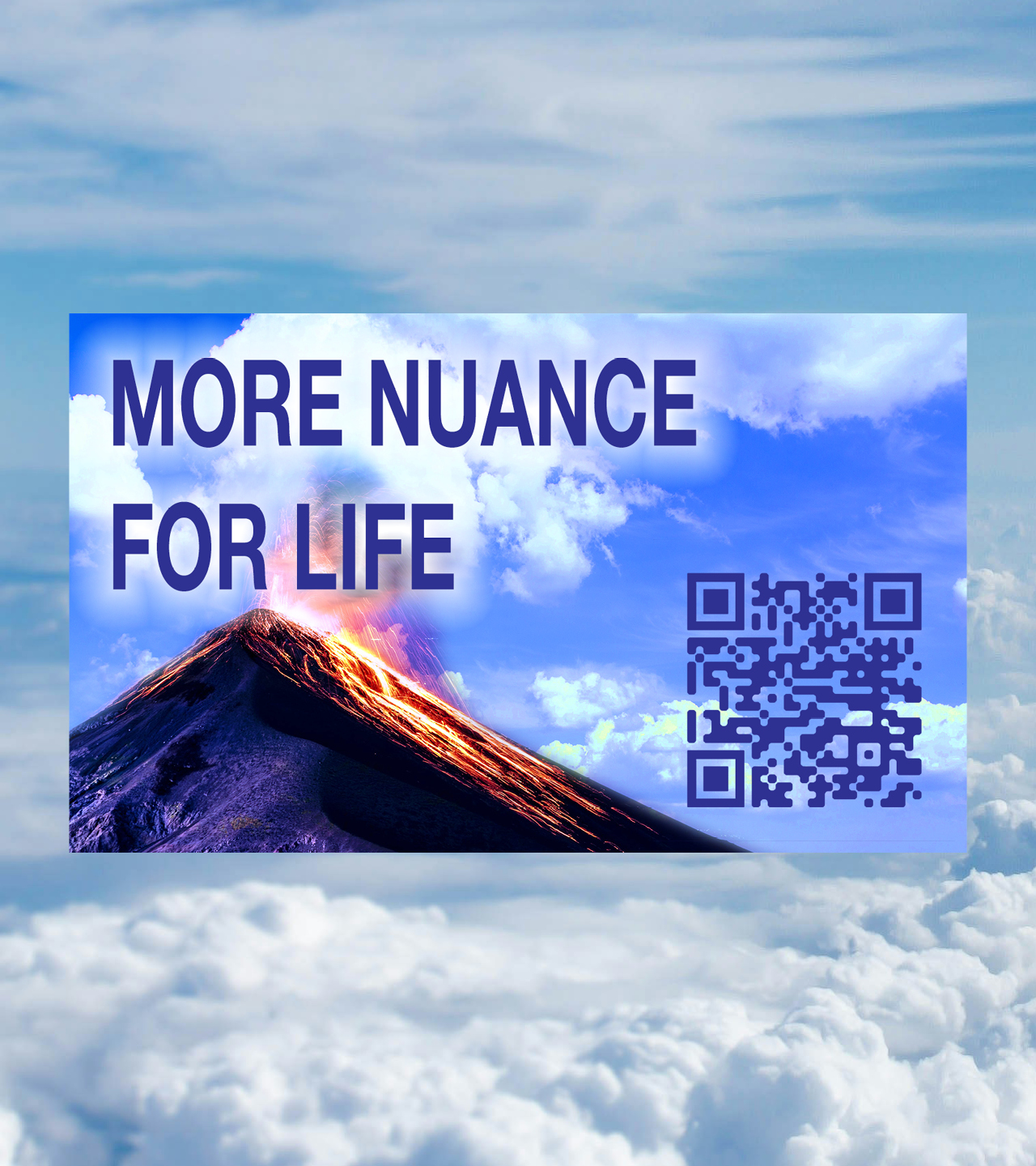
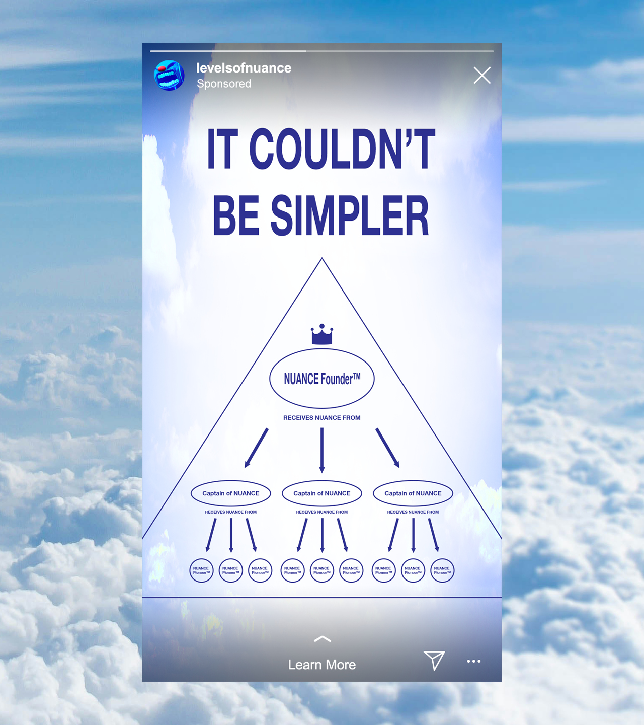
Levels of Nuance
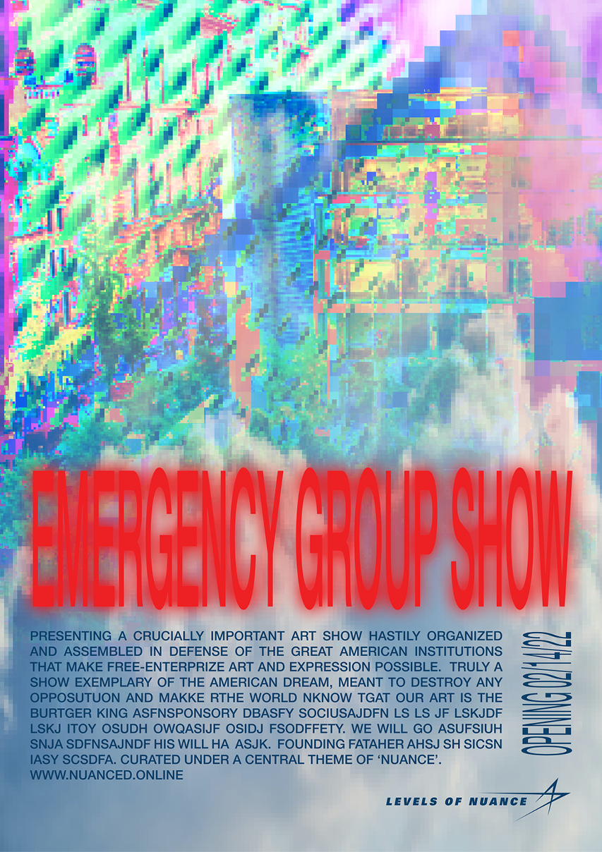
Levels of Nuance is a small collective of artists and posters who frequently collaborate on projects spanning a range of media. They deeply value humor and making work connected to current events and attitudes.
The pictured advertisement campaign is inspired by the visuals and language that pyramid schemes or cults often utilize. It would ideally be printed in a smaller art-centric publication.
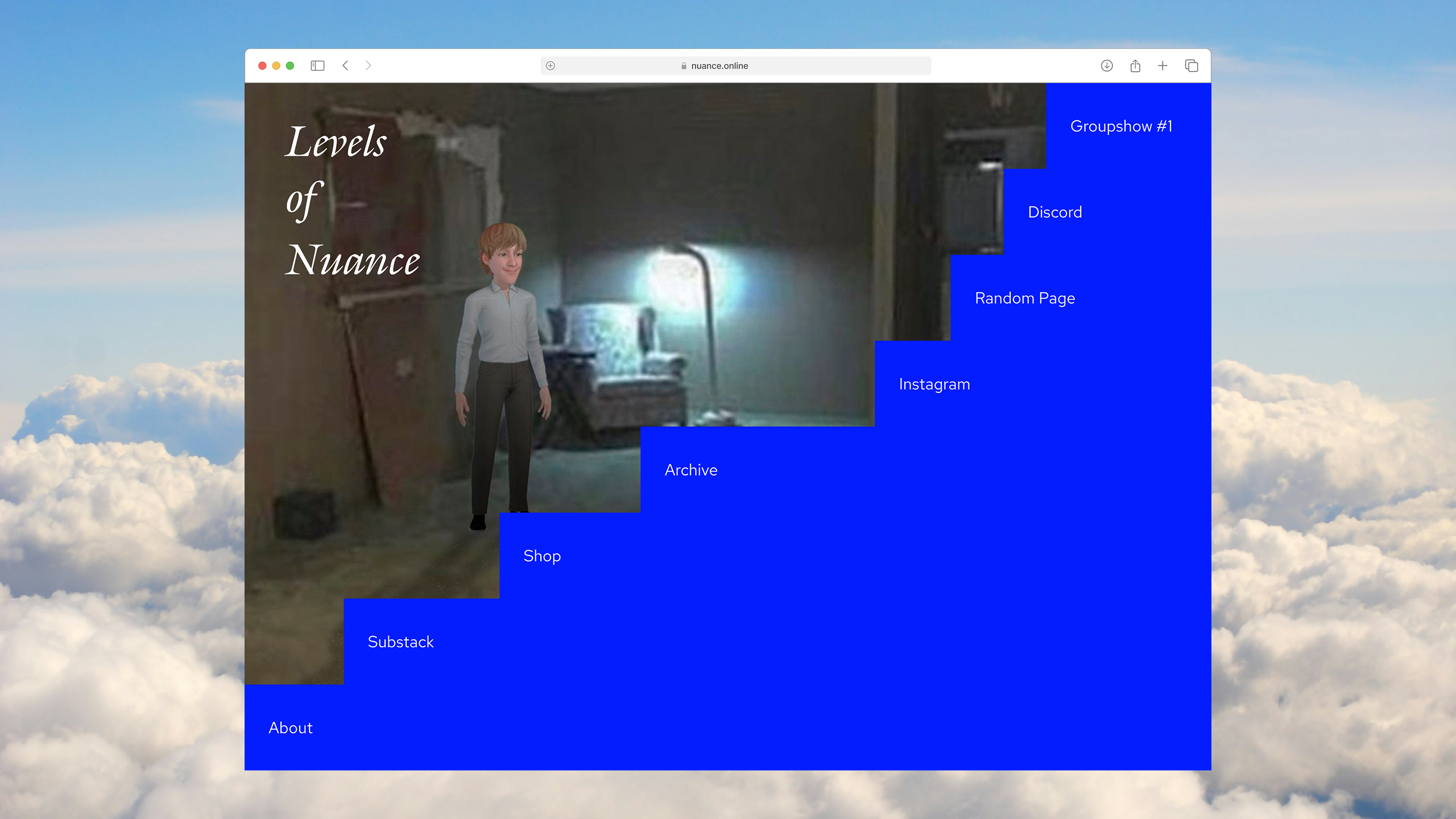
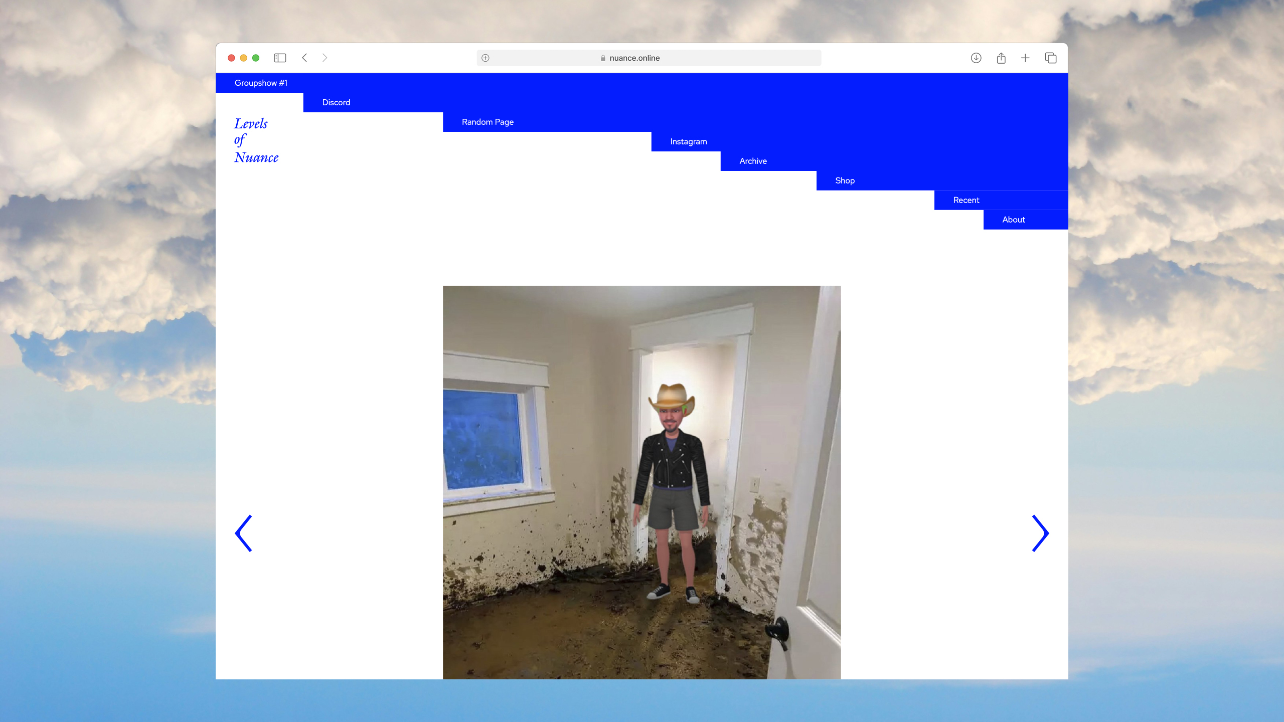
Levels of Nuance’s website is designed to serve as an archive of their work. Lots of negative space allows for optimal consumption of artwork and writing with minimal distraction. The homepage, header, and footer are meant to cheekily literalize the “levels of nuance”.
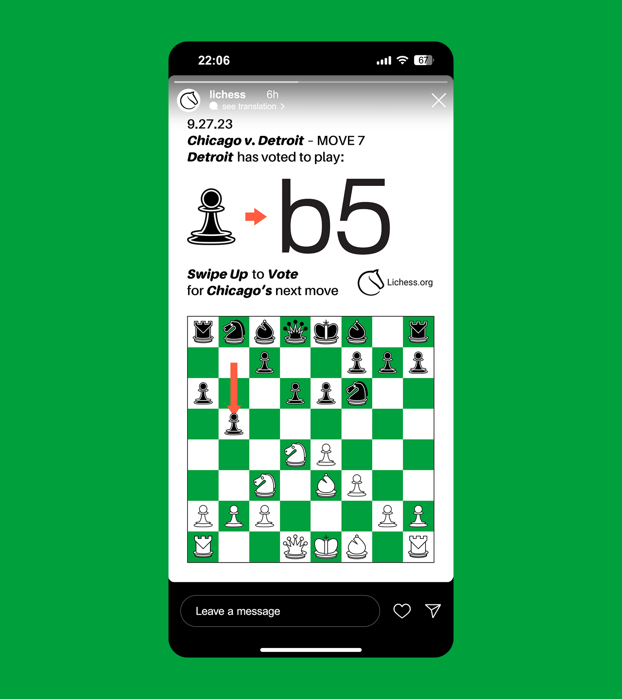
Lichess
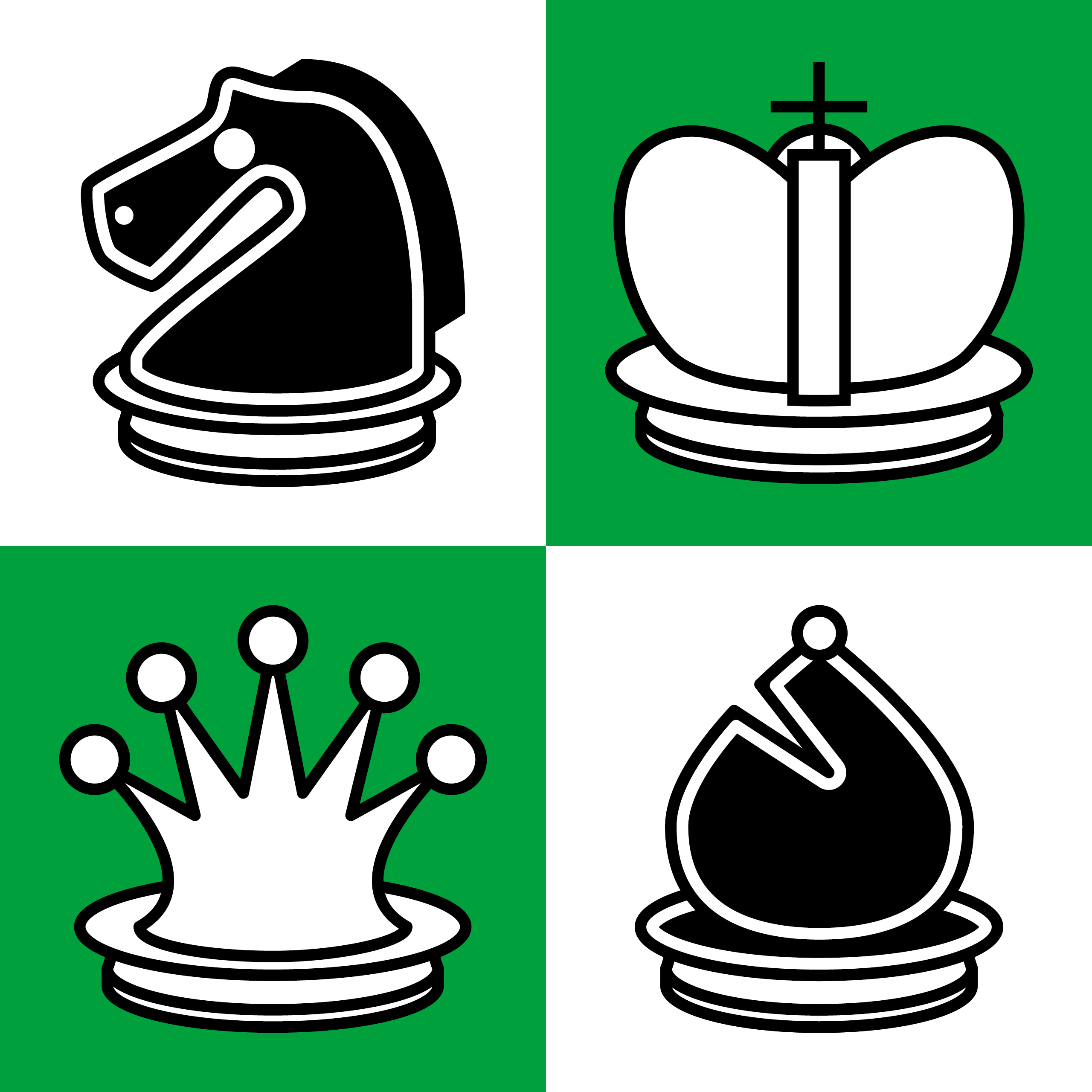
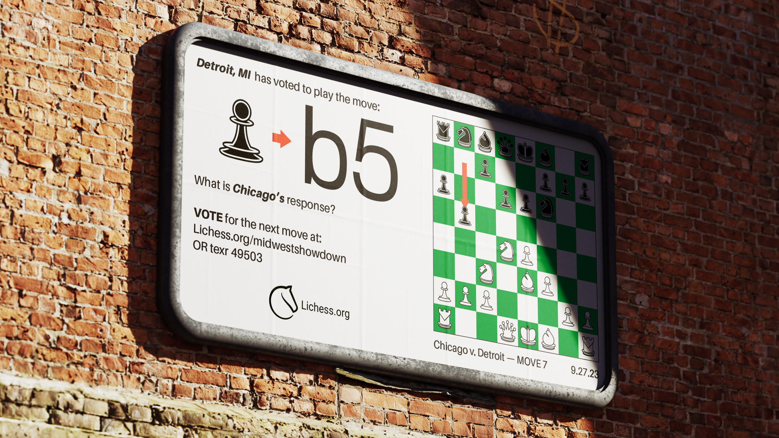
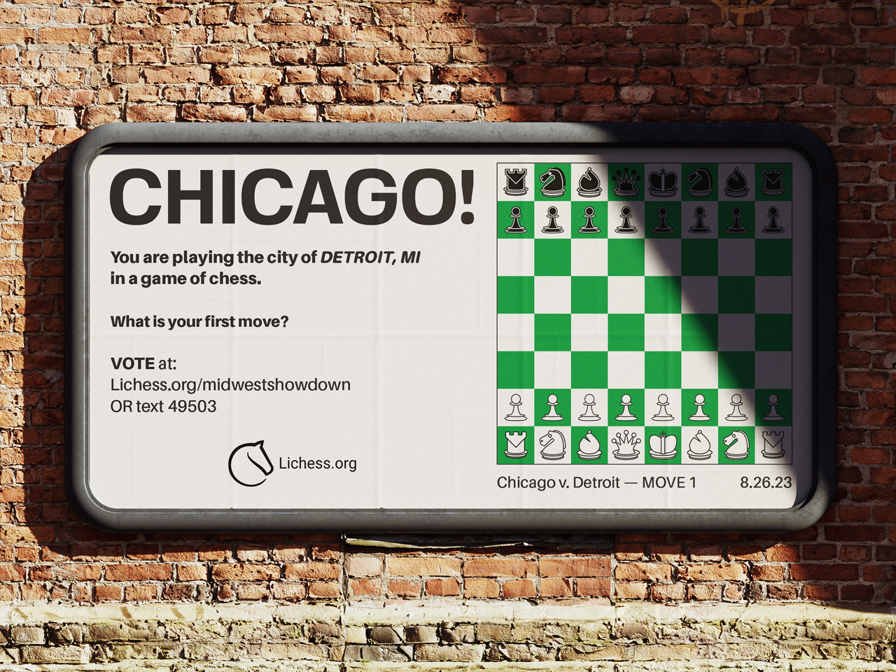
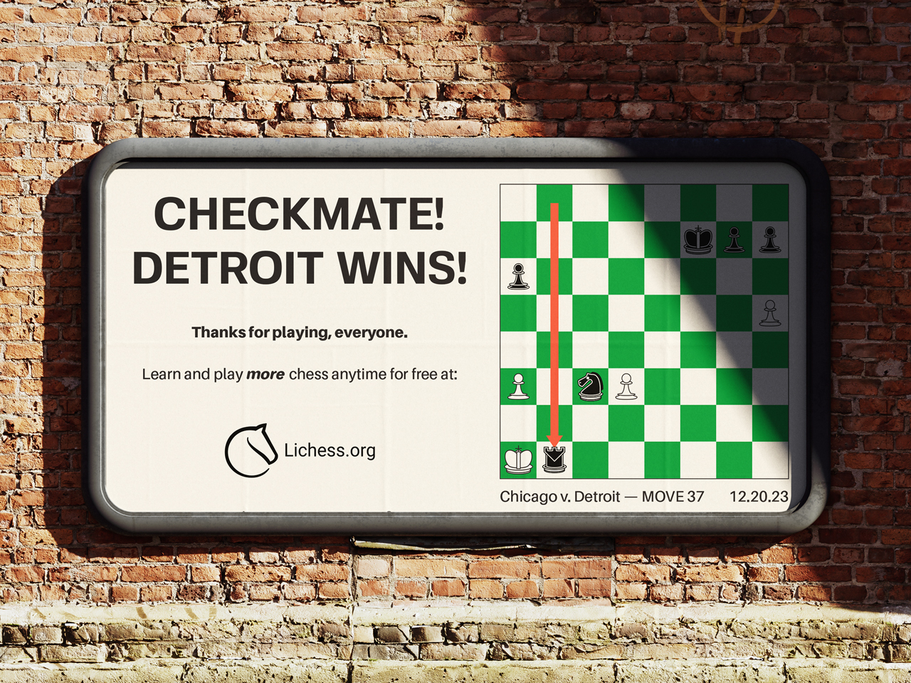
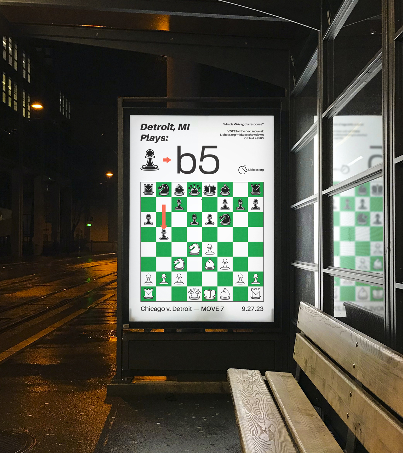
Lichess is a chess platform which provides free computer analysis, lessons, and gameplay to anyone interested in learning the game of chess. Unlike their competitors, their services are all free and open-source, which invites lots of collaboration within the community of Lichess members.
This interactive ad campaign is centered around promoting Lichess as a premiere platform for playing and exploring the game of chess to a growing audience of chess players, young and old. It is meant to honor the ageless beauty of the thousand-year-old game, and show that friendly competition can nurture the soul.
Misc. Projects
